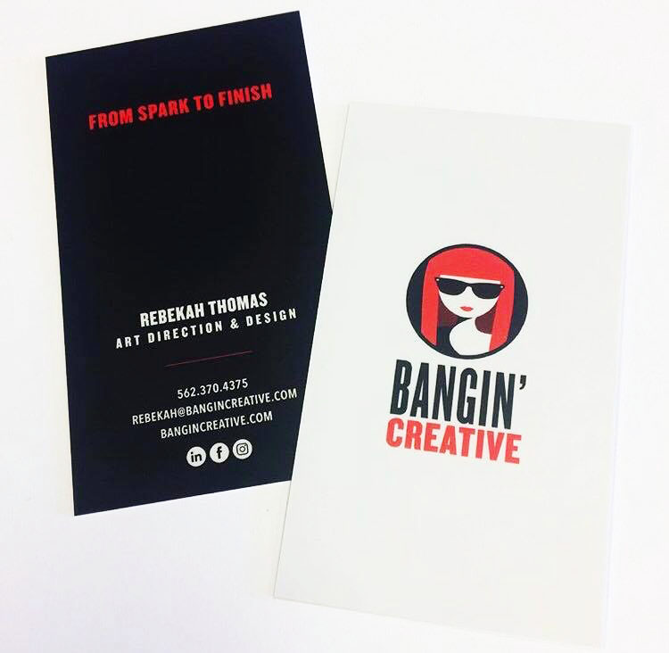
While Rebekah is an amazing artist with a keen eye for design, she was having trouble coming up with a logo for her own company, and thus asked me to help. She already had an idea in mind, but wasn’t sure how to execute it, so for me the process was very simple sincere she had given a clear idea. She wanted something that represented her, much like a character design but more simple. Something easy to read but still held the same merit a solid character design would. Together we were able to come up with her logo and font choice.

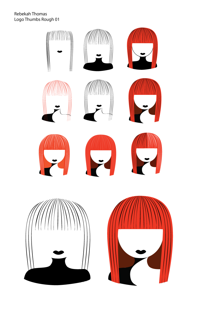
I knew Rebekah wanted something clean and simple with a minimalist approach, while still taking into consideration that it was a design based on her person. Rebekah has bright red hair and, as her business name suggests, bangin’ bangs, so I knew I needed to use that as a leading element.

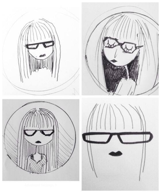
Below you can see my process of finding the right style, simple yet character like. As the above images shows, you can see that Rebekah chose the first sketch, but suggested that we focus on her hair and glasses.
